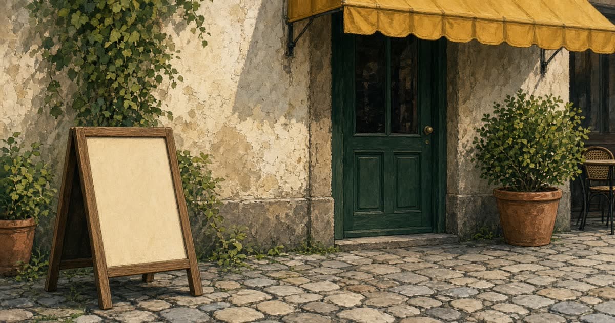
An A-board brings people in when someone can read it without stopping. One offer, large type, a price that matches the menu. Some call it a pavement sign, a sandwich board or a chalkboard; inside, the same idea is the specials board. The job does not change with the name: it speaks to a person who is already outside, in the time it takes to walk past. This works the same for a café, a pub, a restaurant or a takeaway, and there are twenty boards to copy further down.
It is not a second menu, and it is not a poster for the brand. The people who need the board are not your followers. They are hungry, or they might be, and they are deciding in a few seconds whether to come in, look at the window, or keep walking.
One message
Choose one of these, not all of them. Today's special. Lunch, with the hours. A table that can be sat at without booking. The fact that you are open on a day the street looks shut. The thing a passer-by cannot guess from the facade.
If you try to say lunch, the special, the wifi, a quote and your full address, you have said nothing. The eye stops on the biggest words. Make those words the offer. Everything else can live on the menu inside, or in a post for people who are not standing in front of you.
Write the same line in the post you share that day, so the street and the phone agree. A board that says lunch and a profile that says dinner is how someone arrives at the wrong time. The post ideas include this on purpose: the board and the feed should not argue.
Few words, a real price
A headline, the dish or the offer, and a price or a time. That is a full board. The price is the one on the menu, written the way you write it inside. If the special is 14.50, the board says 14.50, not "from 14.50" and not a round number you hope sounds friendlier.
Lemon ricotta ravioli
brown butter, sage
14.50
"Today" does the work of a shout, without an exclamation mark. The dish is the largest line. The detail is smaller. The price is large again. If you are not sure you will have the dish all day, add "until it runs out" in a small line, or take the board in when the tray is finished. A board left out after the dish is gone is a broken promise at the door.
Other boards that pull their weight: "Lunch from 12. Two courses 18." "Open today. Walk-ins welcome." "Kitchen closed Monday. Open Tuesday from 12." Notice that the closed board is still useful. It sends people back on the right day instead of letting them rattle a locked door.
Twenty A-board ideas you can copy
Each one is a whole board: the big line first, then the detail, then the price or the time. Swap in your own dish and your own price. Only put out the one that is true today.
Café
Restaurant
Pub
Takeaway
The inside version works the same way. A specials board by the bar or the counter holds three or four dishes with their prices, and "until it runs out" where that is true. Rub one off when it goes. A board that admits the crab is gone is more believable than one that never changes.
Type you can read from the pavement
Stand where people actually walk, a few paces from the board, and read the main line. If you have to step up to it, the type is too small. The headline and the price should work from there. The detail can be smaller, because only the person who has slowed down needs it.
Thick, simple letters beat thin elegant ones. Light letters on a dark board, or dark letters on a light board, and not a photograph so busy that the words disappear. Your logo can sit small. If the logo is the biggest thing on the board, the board is introducing you to people who are already outside your door. They need the offer more than the name.
The same test applies to a picture of the dish. If you use one, it has to be the plate you serve, readable as food at a glance. A dark or fussy photo wastes the space, and a picture that looks made up does worse than no picture: passers-by have seen a year of AI food slop and look for it. How to get a picture that survives the test is in food photos without a photographer.
Where it stands, and who decides
Put it where it can be seen, and where it does not block the door. A guest with a buggy, a walking frame, a delivery or a pram should get in without stepping into the road. A board in the middle of a narrow pavement fails that test even if the words are perfect. Against your own frontage, off the main walk, is usually the kinder place.
Rules differ by town. Some allow a board on the pavement if it leaves a clear width. Some only allow it on your own ground. Some want you to ask first, and some limit the size. This is not a law you can guess from the street next door, because the street next door may be getting away with something. Check your council, or ask them, before you buy a heavy board you cannot easily move. Take it in at close so it is not an obstacle in the dark.
Wind is a practical rule even where the council is relaxed. A light board that falls into the road is your problem. Weight it, or use the board you can actually bring in when the weather turns. Chalk on a wet day is a different problem: it runs. If your street is rainy, a printed sheet inside a board with a cover will outlast a beautiful handwritten one.
What changes, and what stays
Change the offer when the offer changes. The special in the morning, the notice that it has sold out, the closed day, the holiday hours. Leave the board inside on a day you have nothing specific to say. An old special is worse than a bare doorway.
Keep the look steady so the board is recognised as yours: the same colours, the same place for the price, the same small logo. People who walk the street every day learn the shape, and then they only have to read the new line. A redesigned board every morning asks them to start again, and they will not.
- Change daily: the dish, the price if it changed, the hours if they are unusual today.
- Keep: colours, type, where the price sits, the logo small.
- Take it in: when the offer is gone, when you close, and when the wind makes it a hazard.
Chalk, print, and a PDF
Chalk or a marker is the right tool when you like writing the board and the weather is on your side. It is fast, it costs almost nothing, and the letters can be as big as you want. Handwriting also reads as today. When AI menus went viral this autumn, a Food & Wine editor wrote that the day's specials scrawled in the chef's own hand beat a picture of a dish that cannot be real (quoted by CNN). The limit is your handwriting at arm's length, and the rain.
A printed sheet is the right tool when you want the board to match the rest of your look, or when several people share the job and the handwriting should not be the variable. Restobesto makes a poster for your A-board: you say what it should say, it is painted in a look you choose, every word is read back, and you get a print-ready PDF from A4 up to A1. A4 suits a window or a counter. Larger sheets are for the pavement, if that is the board you own. The file uses 2 posts from your pack. You send it to a printer or a copy shop. We do not print it, and we do not send a paper copy.
Ask the shop for a thick sheet you can slide into the board. You do not need a stack. One is a test: put it out at lunch and watch whether anyone slows down. If they do not, the words are wrong or the type is small, and a second copy will not fix it. Change the line and print again.
The cost of the printing is whatever your shop charges for a single sheet. It sits outside the pack. Whether that sheet is worth it, next to the other small spends, is part of what is worth paying for.
The board is one dish. The menu is the list.
Do not put the whole menu on the pavement. The type shrinks until nobody reads it, and the offer disappears. Inside, a menu can be laid out properly, with a description for each dish, in the same colours. That is a different piece of work from the board. The board gets one line a person can use. The menu gets the rest, for someone who has already decided to look.
If you only do one thing this week, write today's dish in letters you can read from the pavement, with the real price, and take the board in when it stops being true. That is the whole craft.